
| 일 | 월 | 화 | 수 | 목 | 금 | 토 |
|---|---|---|---|---|---|---|
| 1 | 2 | 3 | 4 | 5 | ||
| 6 | 7 | 8 | 9 | 10 | 11 | 12 |
| 13 | 14 | 15 | 16 | 17 | 18 | 19 |
| 20 | 21 | 22 | 23 | 24 | 25 | 26 |
| 27 | 28 | 29 | 30 |
- 코틀린 에러 핸들링
- RecyclerView Sticky Header
- Kotlin Serialization
- power menu 라이브러리
- android compose orbit
- 안드로이드 무한 스크롤
- Android Compose
- 힐트
- 코루틴 공식문서
- 스레드 vs 코루틴
- Hilt 에러
- 안드로이드 커스텀 뷰
- 코루틴 공식 문서
- BOJ
- viewmodel
- hilt
- android orbit
- Thread vs Coroutine
- 백준
- Android Compose Navigation
- runCatching
- Sticky Header RecyclerView
- 백준 2615
- 코루틴
- AAC ViewModel
- Android Custom View
- power menu
- Unsupported metadata version. Check that your Kotlin version is >= 1.0: java.lang.IllegalStateException
- 안드로이드 컴포즈
- Coroutine
- Today
- Total
Beeeam
Custom View 본문
Custom View
개발자가 맞춤 설계한 뷰를 의미한다. 안드로이드에서 기본으로 제공하는 View들로 원하는 것을 구현할 수 없는 경우, 비슷한 형태의 뷰를 반복적으로 사용해야 하는 경우에 사용한다.
한 가지 예를 들어보자
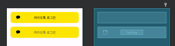
두 개의 뷰가 있다. 둘은 겉 보기엔 같아보이지만 속의 구성을 보면 다른 것을 확인할 수 있다. 위의 뷰는 단일 뷰이지만 밑의 뷰는 겉을 감싸는 CardView, 이미지를 담는 ImageView, 텍스트를 가지고 있는 TextView로 구성이 되어있다. 근데 어떤 것을 사용하는 게 맞다고 정해져 있는 것은 없다.
그럼 밑의 코드를 보자
<!--    첫 번째 뷰    -->
    <com.example.customviewpractice.CustomButton
        android:id="@+id/custom_btn_kakao_login"
        android:layout_width="match_parent"
        android:layout_height="wrap_content"
        android:layout_margin="20dp"
        app:layout_constraintEnd_toEndOf="parent"
        app:layout_constraintStart_toStartOf="parent"
        app:layout_constraintTop_toTopOf="parent"
		app:bg="#fee500"
        app:setTextColor="#000000"
        app:showMark="true"
        app:title="카카오톡 로그인" />

<!--    두 번째 뷰    -->
    <androidx.cardview.widget.CardView
        android:layout_width="match_parent"
        android:layout_height="60dp"
        app:cardCornerRadius="15dp"
        app:layout_constraintTop_toBottomOf="@+id/custom_btn_kakao_login"
        android:layout_margin="20dp" >

        <androidx.constraintlayout.widget.ConstraintLayout
            android:layout_width="match_parent"
            android:layout_height="match_parent"
            android:background="#fee500">

            <ImageView
                android:layout_width="22dp"
                android:layout_height="22dp"
                android:src="@drawable/kakaounion"
                app:layout_constraintTop_toTopOf="parent"
                app:layout_constraintBottom_toBottomOf="parent"
                app:layout_constraintStart_toStartOf="parent"
                android:layout_marginStart="30dp" />

            <TextView
                android:layout_width="wrap_content"
                android:layout_height="wrap_content"
                android:text="카카오톡 로그인"
                android:textSize="18dp"
                app:layout_constraintTop_toTopOf="parent"
                app:layout_constraintBottom_toBottomOf="parent"
                app:layout_constraintStart_toStartOf="parent"
                app:layout_constraintEnd_toEndOf="parent" />

        </androidx.constraintlayout.widget.ConstraintLayout>

    </androidx.cardview.widget.CardView>
3개의 뷰로 구성된 두 번째 뷰보다 단일 뷰인 첫 번째 뷰의 코드가 더 적고, 덜 복잡한 것을 확인할 수 있다.
이것 말고도 다른 장점들도 존재하는데 본인은 현재 상황에서 이러한 장점이 매력적으로 느껴져서 Custom View를 공부, 사용하고 있다.
Custom View 만드는 방법
3개의 요소를 만들어야 사용이 가능하다.
- Custom View의 레이아웃 (~~.xml)
- xml에서 Custom View 속성을 정의할 때 필요한 값을 선언하는 xml (attr.xml)
- Custom View의 동작을 정의할 class (~~.kt)
Custom View의 레이아웃
xml 파일을 하나 새로 생성해서 Custom View의 레이아웃을 정의한다.
<?xml version="1.0" encoding="utf-8"?>
<androidx.constraintlayout.widget.ConstraintLayout xmlns:android="http://schemas.android.com/apk/res/android"
    xmlns:app="http://schemas.android.com/apk/res-auto"
    android:id="@+id/custom_btn_layout"
    android:layout_width="match_parent"
    android:layout_height="60dp">

    <androidx.cardview.widget.CardView
        android:id="@+id/custom_card_view"
        android:layout_width="match_parent"
        android:layout_height="match_parent"
        app:cardCornerRadius="15dp"
        app:cardElevation="0dp">

        <androidx.constraintlayout.widget.ConstraintLayout
            android:layout_width="match_parent"
            android:layout_height="match_parent">

            <ImageView
                android:id="@+id/custom_kakao_mark"
                android:layout_width="22dp"
                android:layout_height="22dp"
                android:layout_marginStart="30dp"
                android:src="@drawable/kakaounion"
                app:layout_constraintBottom_toBottomOf="parent"
                app:layout_constraintStart_toStartOf="parent"
                app:layout_constraintTop_toTopOf="parent" />

            <TextView
                android:id="@+id/custom_text"
                android:layout_width="wrap_content"
                android:layout_height="wrap_content"
                android:text="a"
                android:textSize="18dp"
				app:layout_constraintBottom_toBottomOf="parent"
                app:layout_constraintEnd_toEndOf="parent"
                app:layout_constraintStart_toStartOf="parent"
                app:layout_constraintTop_toTopOf="parent" />

        </androidx.constraintlayout.widget.ConstraintLayout>

    </androidx.cardview.widget.CardView>

</androidx.constraintlayout.widget.ConstraintLayout>
본인이 만들 Custom View의 레이아웃을 여기에 작성을 하면 된다.
보면 위의 예시에서 Custom View를 사용하지 않았을 때 사용했던 구성과 동일한 것을 확인할 수 있다. 이렇게 원하는 형식의 뷰를 한 번 정의 해놓고 필요할 때마다 꺼내서 사용하면 되서 유용하다.
xml에서 Custom View 속성을 정의할 때 필요한 값을 선언하는 xml
res/values 에 attr.xml을 생성하고 다음과 같은 형식으로 선언한다.
<?xml version="1.0" encoding="utf-8"?>
<resources>
    <declare-styleable name="CustomButton">
        <attr name="bg" format="color" />
        <attr name="setTextColor" format="color" />
        <attr name="title" format="reference|string" />
		<attr name="showMark" format="boolean" />
    </declare-styleable>
</resources>
본인은 Custom View의 배경색, 텍스트 색, 텍스트 내용, 이미지 노출 유무를 xml 파일로 받기 위해서 다음과 같이 선언하였다.
<declare-styleable name="CustomButton"> 여기의 name은 다음에 만들 class와 이름을 동일하게 해야한다.
attr name=” ” format=” ” 에서 name은 나중에 Custom View를 사용할 때 xml 파일에서 사용하게 된다.
app:bg="#fee500"
app:setTextColor="#000000"
app:showMark="true"
app:title="카카오톡 로그인"
format은 받을 값의 형식을 선언한다. (reference|string → reference와 string을 받는다는 의미) reference: @string/text
Custom View의 동작을 정의할 Class
class CustomButton(
    context: Context,
    attrs: AttributeSet
) : ConstraintLayout(context, attrs) {

    init {
        initAttr(attrs)
        initView()
    }

    private fun initAttr(attrs: AttributeSet) {
        context.theme.obtainStyledAttributes(
            attrs,
            R.styleable.CustomButton,
            0, 0).apply {

            try {
									// xml에서 전달한 값 받기
            } finally {
                recycle()
            }
        }
    }

    private fun initView() {
        inflate(context, R.layout.custom_view_button, this)
				// view의 스타일 적용 ex) 텍스트 색 변경
    }
}
위와 같은 형식으로 정의하면 된다. (initAttr()와 initView()로 나누지 않아도 되지만 Attribute와 View를 초기화 하는 과정을 나누는 것이 더 보기 편할 것 같아서 나눴음)
먼저 View를 상속 받고, Context와 AttributeSet를 생성자로 받는다.
AttributeSet?
뷰의 동작, 모양 및 사용자와의 상호작용을 정의하기 위해 뷰에 적용할 수 있는 미리 정의된 속성 집합이다.
그리고 try 구문 안에서 다음과 같은 형식으로 xml에서 전달한 값을 받는다.
ex) inputTitle = getString(R.styleable.CustomButton_title)
initView 함수 안에서는 View의 초기 설정을 해준다.
ex) 텍스트 색 변경
val titleTextView = findViewById<TextView>(R.id.custom_text)
titleTextView.text = inputTitle
private이 아닌 일반 함수에 view의 동작을 정의 한다.
ex) 이미지 제거
fun disappearMark() {
        val kakaoMark = findViewById<ImageView>(R.id.custom_kakao_mark)
        kakaoMark.visibility = View.GONE
}
이렇게 정의해 놓으면 kt 파일에서 선언한 Custom View.함수명 형식으로 사용이 가능하다.
ex) disapperMark() 사용
val btn5 = findViewById<CustomButton>(R.id.custom_btn_kakao_login)
btn5.disappearMark()
이런 식으로 사용이 가능하다.
완성된 코드
class CustomButton(
    context: Context,
    attrs: AttributeSet
) : ConstraintLayout(context, attrs) {

    private var inputShowMark: Boolean = false
    private var inputTitle: String? = null
    private var inputTextColor: Int = 0
    private var inputBg: Int = 0

    init {
        initAttr(attrs)
        initView()
    }

    private fun initAttr(attrs: AttributeSet) {
        context.theme.obtainStyledAttributes(
            attrs,
            R.styleable.CustomButton,
            0, 0).apply {

            try {
                inputTextColor = getInteger(R.styleable.CustomButton_setTextColor, 0)
                inputBg = getInteger(R.styleable.CustomButton_bg, 0)
                inputTitle = getString(R.styleable.CustomButton_title)
                inputShowMark = getBoolean(R.styleable.CustomButton_showMark, false)

            } finally {
                recycle()
            }
        }
    }

    private fun initView() {
        inflate(context, R.layout.custom_view_button, this)

        val titleTextView = findViewById<TextView>(R.id.custom_text)
        val customCardView = findViewById<CardView>(R.id.custom_card_view)
        val kakaoMark = findViewById<ImageView>(R.id.custom_kakao_mark)

        titleTextView.text = inputTitle

        customCardView.setCardBackgroundColor(inputBg)
        titleTextView.setTextColor(inputTextColor)

        if(!inputShowMark) kakaoMark.visibility = View.GONE
    }

    fun disappearMark() {
        val kakaoMark = findViewById<ImageView>(R.id.custom_kakao_mark)
        kakaoMark.visibility = View.GONE
    }

클릭 이벤트가 발생한 경우 disappearMark 함수를 호출하여 이미지를 제거하는 뷰를 만들었다.
사용 후기
사용하면서 확실히 더 편하고 유용하다는 것을 많이 느꼈다. 첫 번째 뷰 처럼 한 개의 뷰로 구성 되어 있으면 하나 만들고 사용하면 될 거 같은데 여러 개인 경우에는 다 만들기는 힘들 것이다. 그렇다고 다 복붙하여 사용하면 코드가 지저분해질 것이다.
근데 커스텀 뷰로 묶어서 정의하면 코드가 깔끔해질 것이고, 본인의 정의에 따라 텍스트 색, 배경 색도 변경하여 사용할 수 있기 때문에 유용하다는 생각이 들었다.
단순히 터치하면 뷰 내의 이미지를 제거하는 뷰를 만들면서도 장점을 많이 느꼈는데 나중에 더 복잡한 작업을 수행하는 커스텀 뷰를 만들고 적용하면 위에서 언급했던 장점들을 더 많이 느낄 수 있을 것 같다.
'Android' 카테고리의 다른 글
| Timber Library (1) | 2023.06.04 |
|---|---|
| Splash screen api (0) | 2023.06.01 |
| 앱 내부에서 카메라 실행시키기 (3) | 2023.04.19 |
| 안드로이드 스튜디오 타이틀 바 제거하기 (0) | 2023.04.14 |
| Hilt? (0) | 2023.04.11 |


